Here’s how we revamped a just-the-right-size e-commerce brand.
PKS Sähkökauppa, which offers straightforward and reliable service, sells electricity to both large and small consumers—individuals and businesses alike. Over the past 80 years, this local operator has grown into a reliable and community-focused electricity provider owned by the municipalities of North Karelia, with its profits directed toward the benefit of the municipalities of Koto-Suomi.
PKS Sähkökauppa’s strategic goal is to grow from a local player into a nationwide electricity retailer, achieving 5% annual growth in the number of customer locations. To support these goals, we developed a brand strategy, brand identity, and visual identity for PKS Sähkökauppa.
Starting point: a big promise, a unique approach
The energy market is changing rapidly. The demand for clean energy, the energy transition, and digitalization are major issues that are evident in customers’ daily lives. PKS Sähkökauppa’s mission is to make this change understandable, not more complicated. We built the very core of our transformation around this idea.
A Strategy and Identity That Endures
Together with the client, we clarified the brand’s core: a vision to be the best online electronics store ever, a mission to make everyday life run smoothly, and a promise of welcoming service that actually works. The strategy boils down to the idea: “big enough to be trusted, but small enough to care about each and every customer.”
From this core idea, the brand manifesto “For All of Us, So Different Yet So Alike” was born. It’s a cozy, warm, and distinctly Finnish story about how, even though we Finns are all unique in our own way, we all use the same kind of electricity. And that’s why it’s good for an electricity retailer to be one that truly reflects who we are.
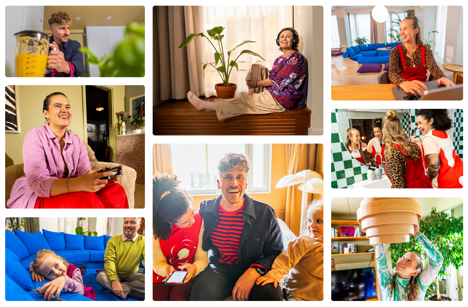
Visual identity: a bolder red
In its visual identity, PKS Sähkökauppa now features a bolder use of red. The brand color was made brighter and warmer, serving as the dominant element, complemented by reddish brown, vibrant pink, and clear pink.
To build a typographic identity, we designed a unique headline font called Oma Sans, which gives the visual identity a distinctive edge. To complement it, we selected New Spirit to bring organic warmth, Bebas Neue Pro for sharp, bold clarity, and Inter as the body font for all communications.
The graphic element—two angled corners, with the space between them resembling the flame motif in the logo—provides a strong and recognizable framework for the visual identity. The visual style, in turn, conveys positive energy and a message of joy in diversity: authentic personalities, natural situations, and a taste of real life—not a polished advertising portfolio.
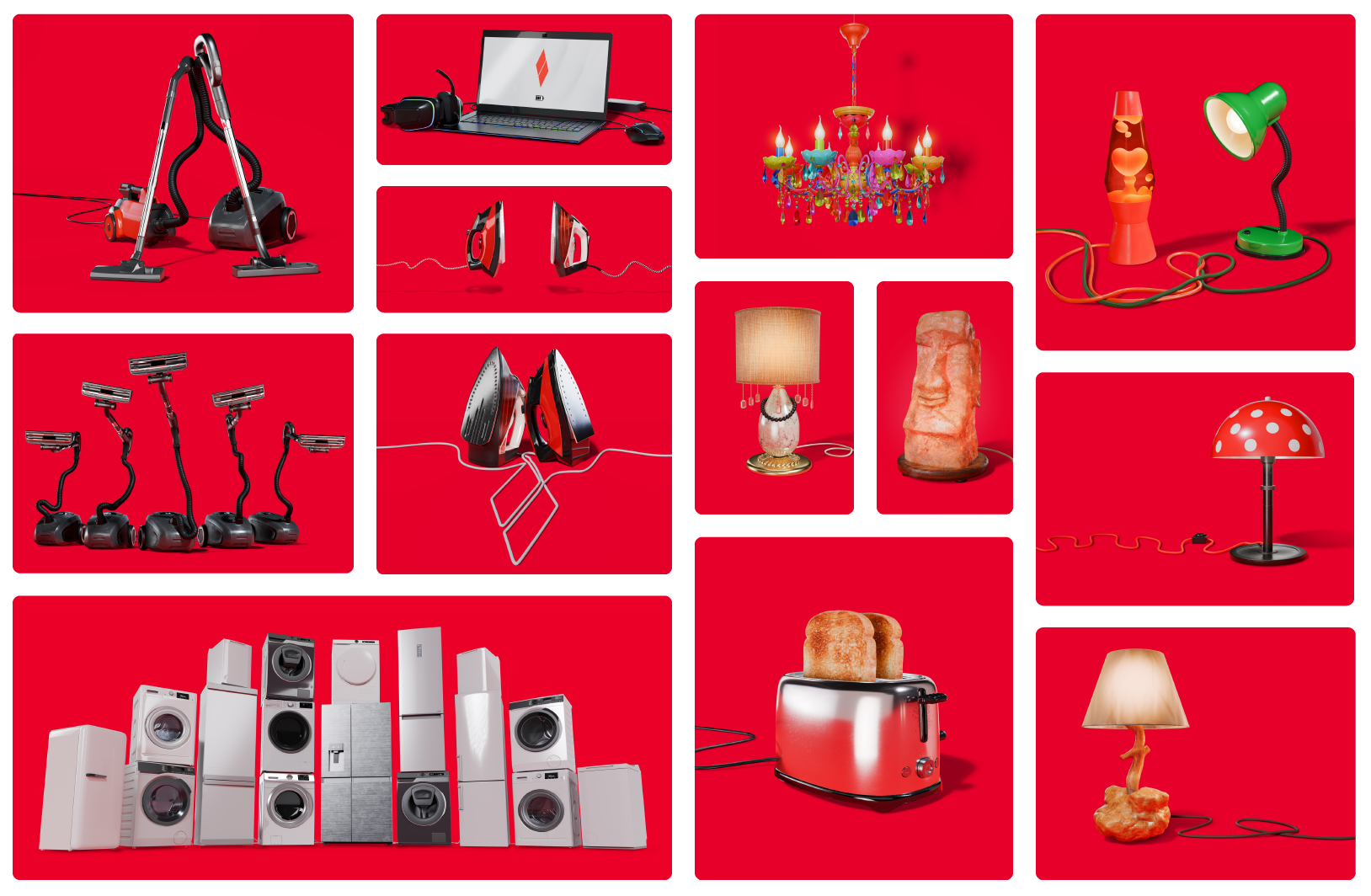
A concept that stands out from the industry noise
We also designed and implemented a distinctive marketing communications concept and a multimedia campaign for the revamped brand to boost brand awareness and growth.
We put all kinds of everyday time-savers—toasters, vacuum cleaners, table lamps, and chandeliers—in the spotlight they deserve as characters. This entertaining blend of the sublime and the mundane stood out from industry conventions, where electronics are often discussed in either technical or impersonal terms. We wanted to do things differently: speak to people in a human way, with a twinkle in our eye but always professionally.
The campaign was summed up succinctly and irrefutably:
The best of the best.
Do you want to make sustainability a credible part of your company’s operations?

Get in touch!
Luodaan yhdessä vaikuttavia tuloksia.
Ville Timonen
Luova johtaja, Osakas